You asked, we listened.
We’ve been working hard to bring you the features you’ve told us will make unlocking insights in your data faster and easier.
We’ve got a big one this month. Analysis now comes super-charged with Significance Testing.
 Significance Testing
We’re excited to introduce Significance Testing—a powerful new tool that helps you instantly assess whether the differences in your survey data are statistically significant.
This new feature ensures that your insights are not just the result of random fluctuations but reflect genuine patterns or trends.
How it works
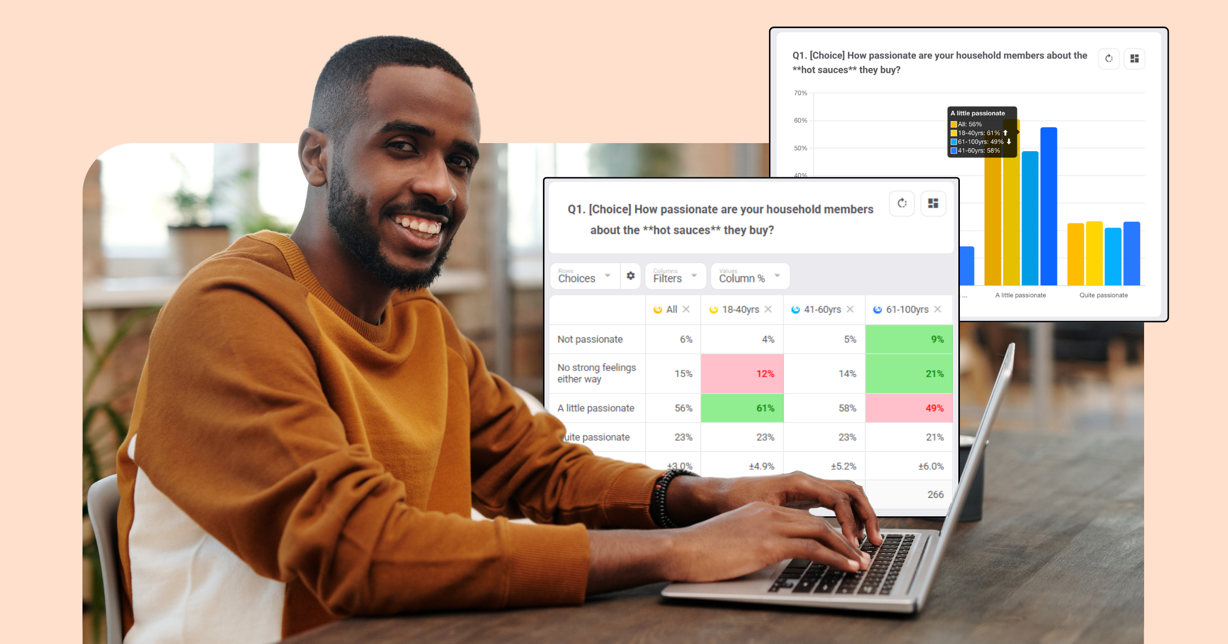
Significance testing evaluates whether the differences between groups or responses are statistically significant. By comparing data points, it indicates whether the differences observed are likely due to chance or are a real finding.
So, how might you use significance testing? For example, if you want to compare the results between a cohort and the total sample (e.g. Males vs. All Adults), significance testing will help you understand whether the differences in responses are substantial enough to to be a real difference rather than due to chance.
Significance testing is a game changer
Significance testing empowers you to make more informed decisions by making it easy to discover real differences in sentiment, opinion or behaviour. Spotting statistically significant differences instantly helps reveal insights so you can identify opportunities.
Key Benefits:
- Save time: The significance markers quickly draw your attention to data differences.
- Improved Confidence: The markers indicate where differences are statistically significant, so you only focus on what matters.
Get started with significance testing
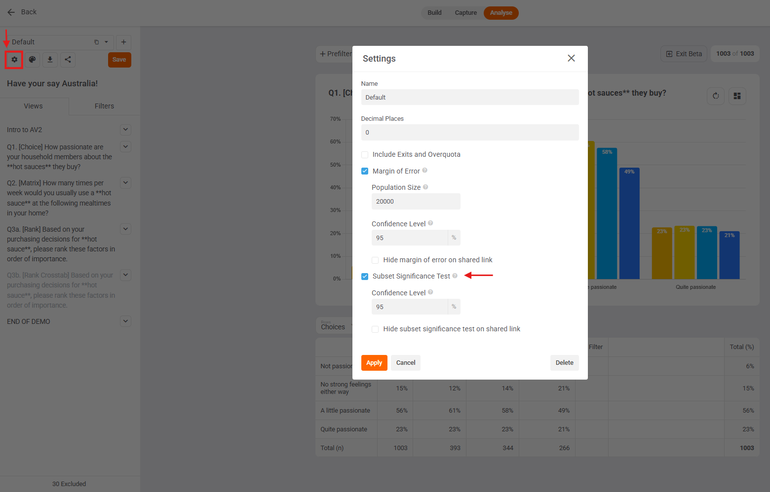
Significance testing can be enabled in your dashboard by ticking “Subset Significance Test” in your dashboard settings (cog icon top left)…..
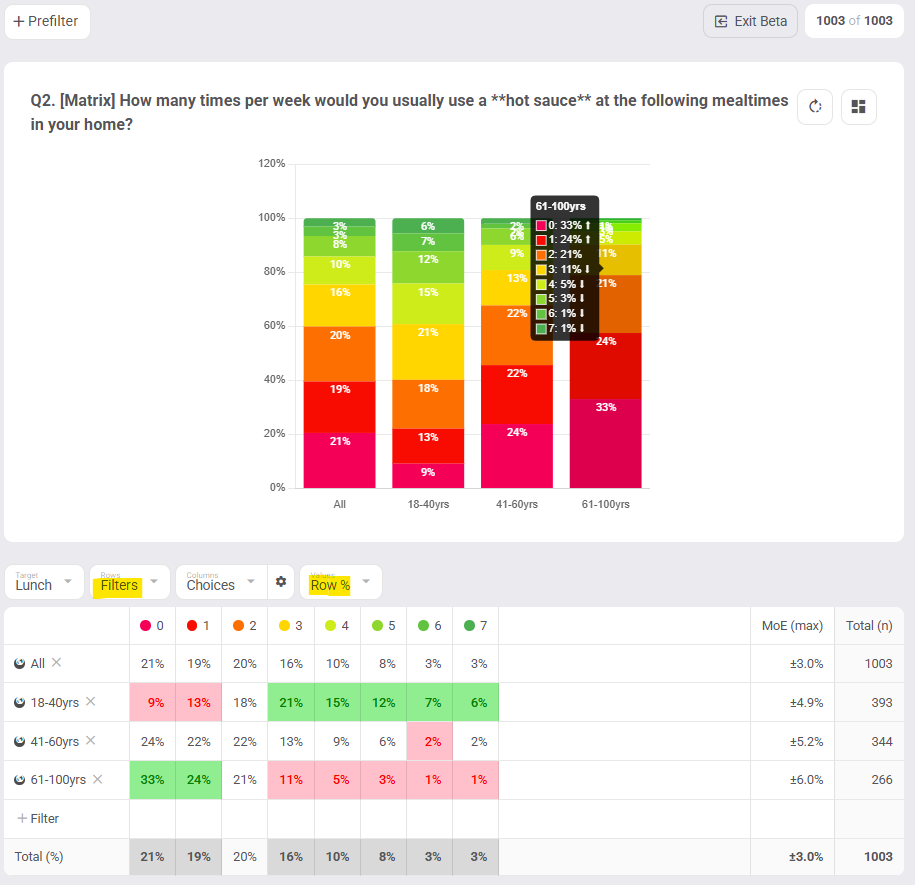
Statistically significant values will be highlighted in green (higher) or red (lower) in your data tables. They will also appear in your charts as white up / down arrows in the chart tooltip. Simply hover over bars in charts to view the significance markers.
If needed, you can also adjust the confidence level and toggle significance testing in the dashboard settings (cog icon top left).
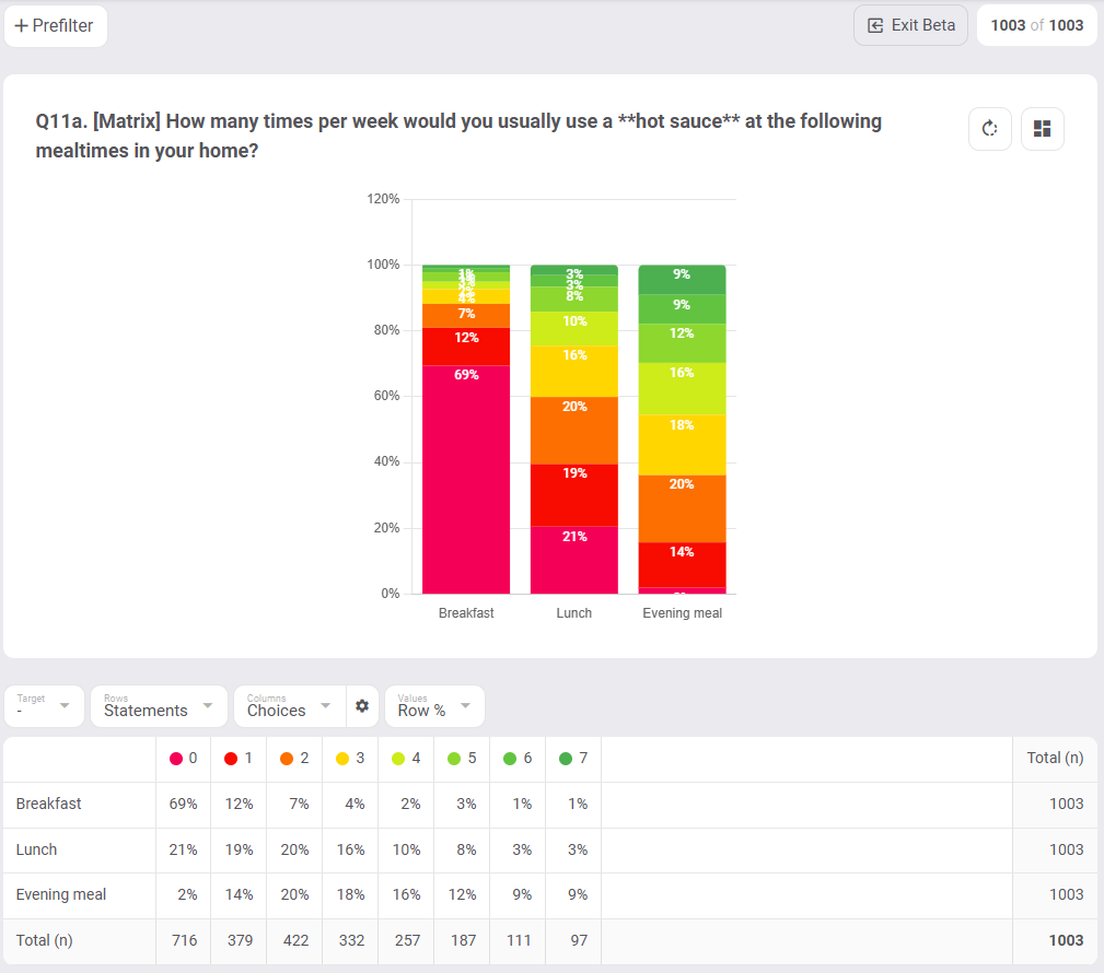
Significance Testing V1 is applied in 2 cases:
- If your table’s Values are set to Row %, then you will see if each row’s percentages are significantly higher (green) or lower (red) compared to the Total (%) row.
2. If your table view’s Values are set to Column %, then you will see if each column’s percentages significantly differ from the Total (%) column.
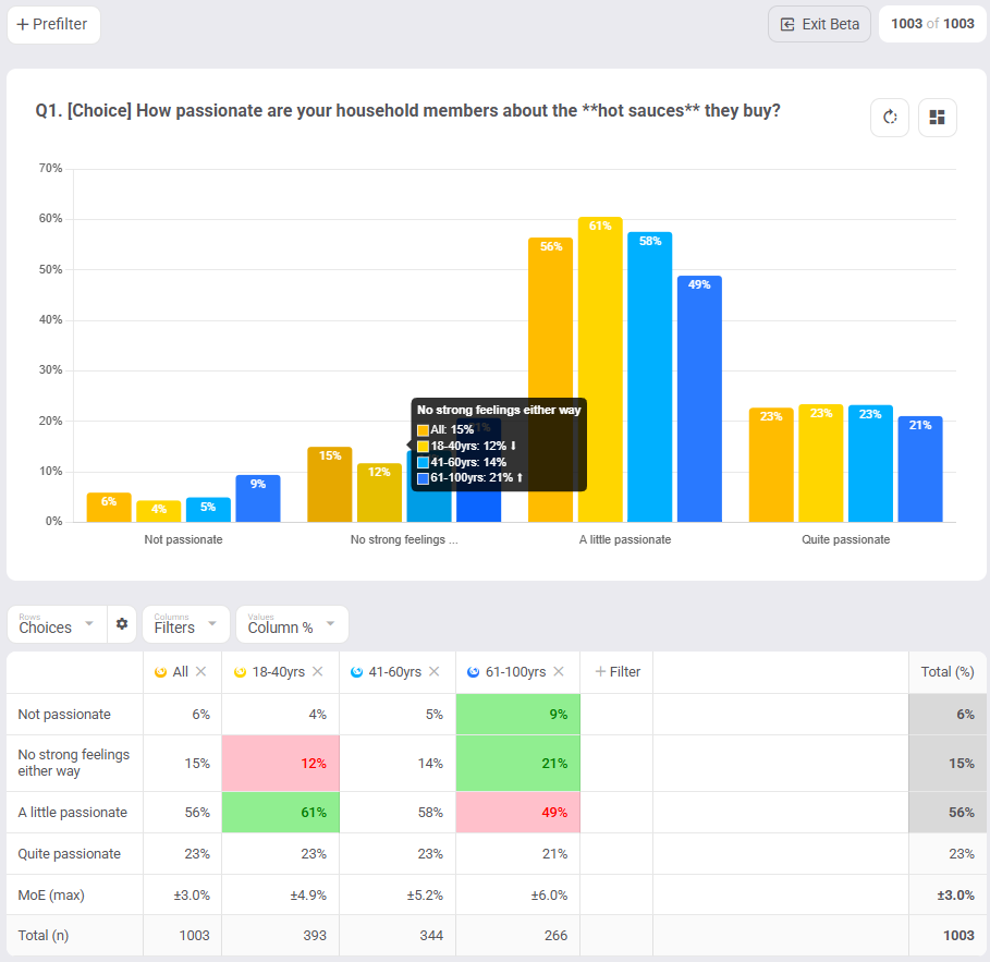
Sig testing will display not only for tables (green/red cells) but also for charts (white up/down arrows in chart tooltip)
Note: Sig testing when Values = Average is not part of this deployment, but it is currently in development.
 Margin of Error
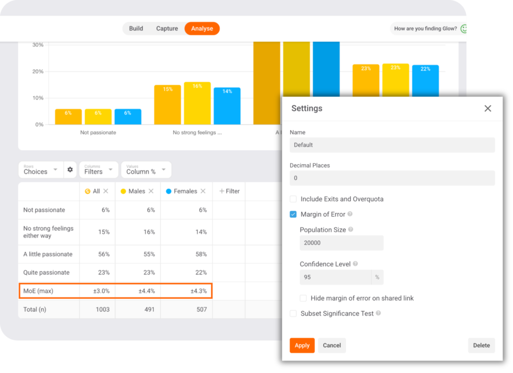
We’ve added a margin of error calculation to your survey results to complement significance testing. The margin of error quantifies the uncertainty inherent in any survey, offering a clearer picture of the potential variability in your findings.
How it works
The margin of error is calculated based on your sample size and the desired confidence level. This gives you a range around your results that represents the possible variation in your data. A smaller margin of error means that your results are more precise, while a larger margin indicates a greater potential for fluctuation.
Example Use Case: Let’s say your survey shows that 55% of respondents prefer Product A over Product B. With the margin of error included, you might see that the true preference could range from 52% to 58%. This helps you understand how reliable your finding is and how much variability to expect.
Why it's valuable
Margin of error will help you interpret your data with greater accuracy. It’s important to understand that all survey results carry some degree of uncertainty, and this feature gives you a concrete way to measure that uncertainty. With margin of error, you or your clients will never be blindsided by unexpected variations in your findings.
Key Benefits:
- Transparency: See the potential variability in your data.
- Context: Understand the level of confidence you can have in your results.
- Better Decision-making: Make more robust decisions by considering the level of uncertainty in your data.
Get started with Margin of Error
To view the margin of error, go to your dashboard settings (top left corner) and tick the “Margin of Error” checkbox. The margin of error will automatically appear next to sample sizes in your tables and charts where percentages are calculated.
Where and when the Margin of error will appear will change based on how your table’s values are displayed. For a detailed explanation check out the full guide in our help centre.
Dashboard Downloads
We know that sharing insights and collaborating with your team is crucial, so we’ve enhanced our Dashboard Downloads feature. This update gives you more options for exporting your data, making it easier to generate reports and presentations directly from your dashboard.
Download Crosstab Tables to Excel
With this update, you can download all the tables across your dashboard views into an Excel workbook. Each view will be placed in its own tab, allowing you to keep your data organised and accessible.
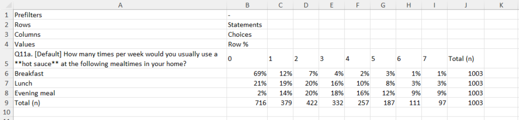
How It Works: Simply click the Download button under your dashboard name and select Workbook (xlsx). The data will be downloaded as an Excel file, with each dashboard view organised in separate tabs for easy navigation.
What’s New: Whether your data is presented as basic tables or more complex crosstabs, this feature allows for seamless export and manipulation of your custom data in Excel. No more copying and pasting!
Download Charts to PowerPoint
You can now also export charts from your dashboard directly into PowerPoint, making it easier than ever to share your findings in presentations. The best part? These charts are fully editable in PowerPoint, and you can even modify the data behind them.
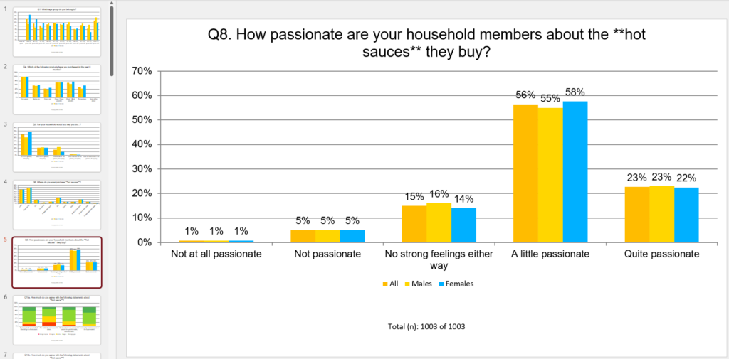
How It Works: Click the Download button in the top left corner of your dashboard and select PowerPoint (pptx). The charts will be exported to a PowerPoint file, ready to be inserted into your presentations.
What’s New: Unlike static images, these charts are fully editable in PowerPoint. Right-click the chart to access Edit Data, which allows you to update or adjust the underlying data directly within the PowerPoint file.
Note: Word clouds are not yet downloadable to PowerPoint, but you can still export the full answer list to Excel using the Download Tables feature.
Global Filters
This latest update to analysis filters makes it even easier to see how specific cohorts or responders have answered across your entire data set.
You no longer need to add filters across each specific question view. When adding prefilters (‘+Pre filter’ above your chart) or cross filters (‘+Filter’ in your table rows or columns), you can now add/remove them globally across all views in your dashboard.
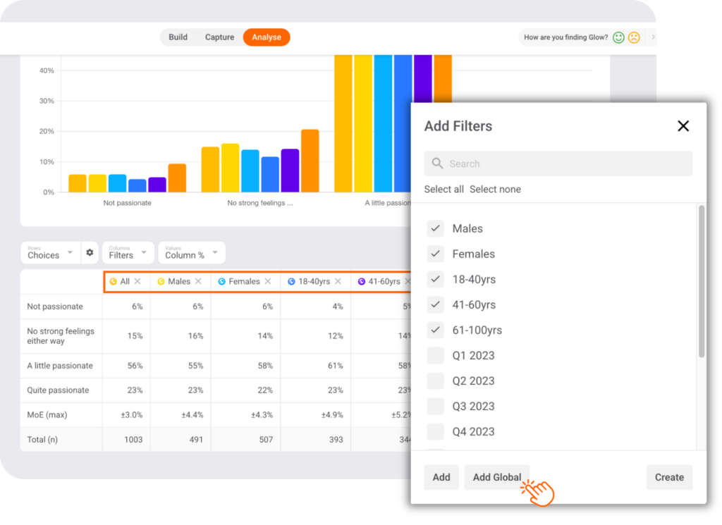
Simply click “Add” to add selected filters locally or click “Add Global” to add them globally.
Global filters will have a globe icon next to them so you know they’ve been added to (and can be removed from) all views in your dashboard, not just the current view.
Other updates
Dashboard Decimals – Adjust the number of decimal places displayed across your dashboard in your analysis settings. Changed will be reflected across charts, tables, PowerPoint chart exports, and Excel downloads.
Share Link Logo – customise your share links with your own logo. Simply make sure that you’ve added a logo to your account settings (Account/Details) and it will be carried through to any shared links you create.
Take them for a spin
Current customer? Log in to the platform now to try these new features or contact your account manager for a detailed walk-through.
Want a live demo? Either book an intro or speak to your Account Manager to see this powerful functionality in action.
New to Glow? All of Glow’s advanced survey features are FREE. Create a Glow account here.

Manny Marasigan
Product Manager at Glow