
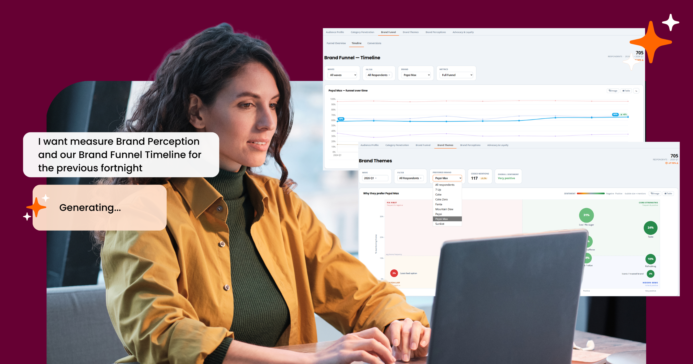
Most brand trackers hand you a deck once a quarter and call it insight.
By the time it lands, the campaign’s already moved on, the budget’s already spent, and the “so what” is buried in an appendix nobody opens.
We built the Glow Brand Tracking Dashboard to work differently – live, flexible, and built around the decisions your team actually needs to make, not the ones a template assumes you’ll make.
Glow on. Have a walkthrough of what’s inside:
Read on or jump straight to the interactive demo to click through it yourself.
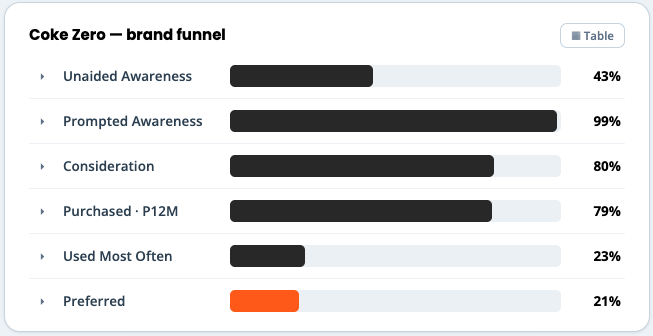
 Funnel Overview: your entire brand health story, at a glance.
The dashboard opens on the Brand Funnel – unaided awareness through to preference, visualised as a single funnel so you can see exactly where your brand is winning attention and where it’s leaking it.
Why It Matters
- No more stitching together six different reports to answer “how’s the brand doing”
- One view for stakeholders who want the headline, without losing the detail underneath
- Sets the baseline before you go looking for the “why”
Benchmark against the category, not just yourself.
Every metric expands to show how you stack up against named competitors – not an anonymised “industry average,” but the actual brands your customers are choosing instead of you.
Why It Matters
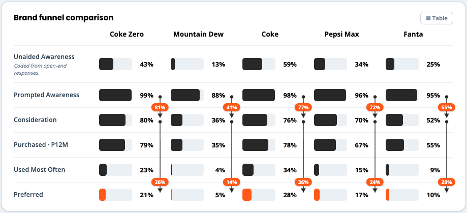
- Context turns a number into a decision. 43% unaided awareness means nothing on its own – it means a lot next to a competitor sitting at 59%
- Competitive movement shows up before it becomes a trend line you have to explain in hindsight
Cut the data any way you like.
Every funnel and metric can be filtered live – by age, gender, state, household, decision maker status, work status, or income – without leaving the view you’re in.
Why It Matters
- Find the segments actually driving (or dragging) your numbers
- No more raising a request and waiting three days for a cross-tab
- Turns one dashboard into as many views as you have questions
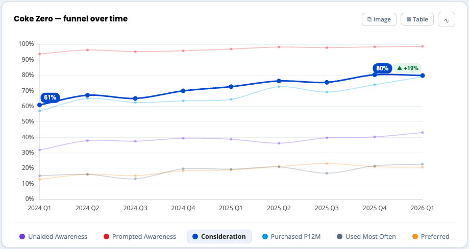
 Timeline: see exactly when your brand’s momentum shifted
The Brand Funnel Timeline plots every metric across waves, so instead of comparing this quarter to last quarter in isolation, you can see the full trajectory – and pinpoint the exact wave where something changed.
Why it matters
- Connects brand movement back to what was actually happening in market at the time
- Makes it obvious whether a dip is noise or a genuine trend
- Turns “brand tracking” into an actual timeline of cause and effect, not a snapshot
Conversions: how your funnel compares, stage by stage
The Conversions view lines your brand up against up to five competitors across your entire marketing funnel. See exactly where you’re converting well and where you’re losing people to someone else.
Why it matters
- Shows precisely which stage of the funnel needs the marketing investment
- Makes competitive gaps specific and actionable, not just a feeling
Brand Themes: understand why people actually prefer you
Beyond the numbers, Brand Themes analyses open-ended responses and plots them by sentiment and frequency – surfacing your core strengths, hidden gems, and the things worth fixing first.
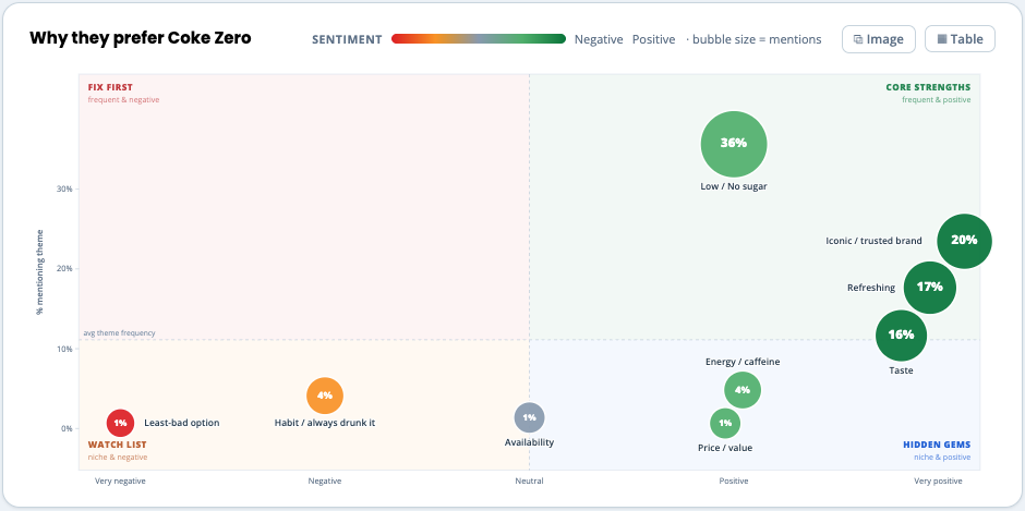
Why it matters
- Gets past “we scored well on trust” to why
- Flags the small-but-negative themes before they grow into a bigger problem
- Gives your creative and comms teams language straight from your actual customers
Brand Statements: benchmark the attributes that matter
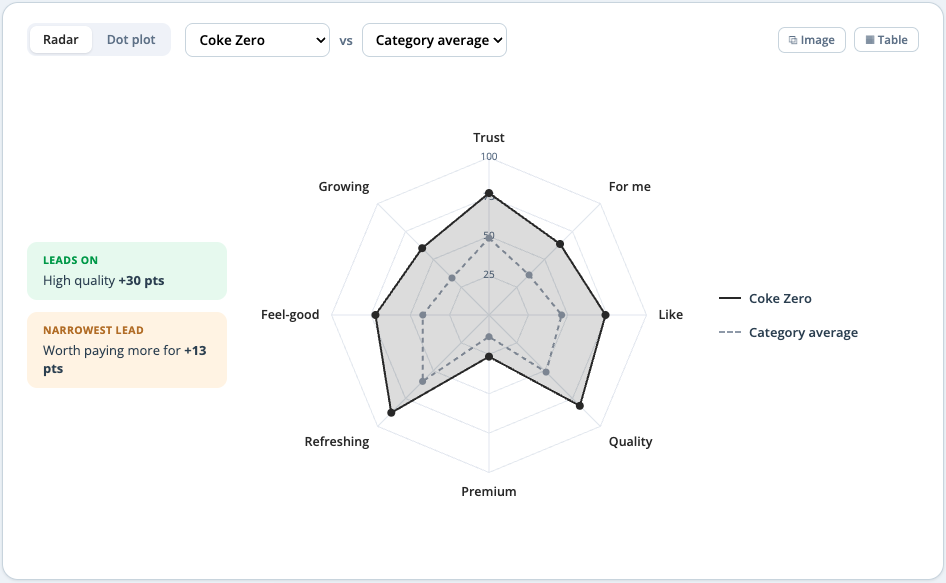
The Brand Perceptions view benchmarks your brand across your category-defining attributes. See how you compare against competitors or the category average.
Why it matters
- Shows exactly where you lead and where the gap is narrowest (and most winnable)
- Makes brand positioning conversations evidence-based instead of anecdotal
Advocacy & Loyalty: know where retention is really at stake
Net Promoter Score and switching likelihood, side by side – so you can see not just how loved your brand is, but how vulnerable your customer base actually is to a competitor’s next move.
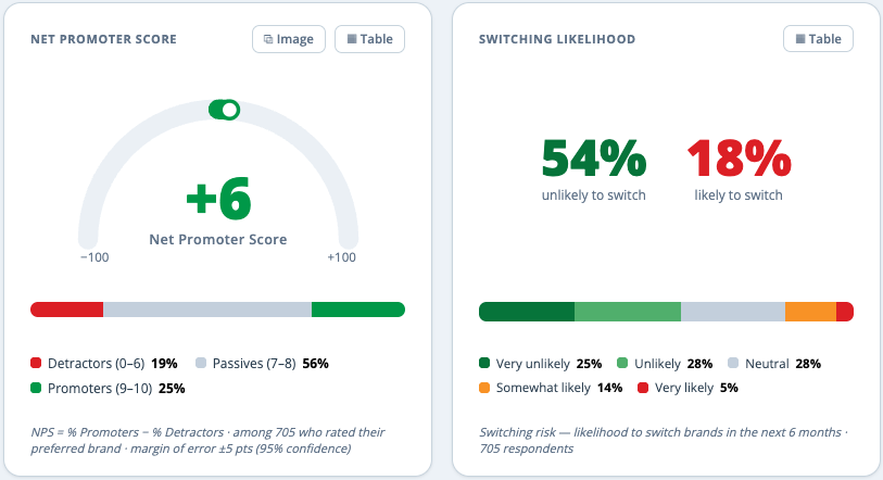
Why it matters
- NPS on its own is a lagging indicator; paired with switching risk, it becomes a warning system
- Segment loyalty by preferred brand to see exactly where you’re strong and where you’re exposed
Category Penetration: size the opportunity
Zoom out from your brand to the category. Category Penetration shows what portion of the population is already buying into your space – and how big that market actually is.
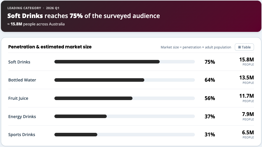
Why it matters
- Grounds brand strategy in real market size, not assumptions
- Useful context when making the case for budget internally
Want to see it work with your own brand?
If you’d rather explore this on your terms, you can try the interactive demo yourself, or get a sense of cost first with our instant price estimate – set your tracking frequency, sample size, and category penetration, and get a ballpark in seconds.
Every plan includes:
- Up to 5 brands tracked
- Up to 8 customisable brand metrics
- Historical data load (up to 2 years)
- Branded tracker dashboard
- Summary results every wave
- Full data quality review every wave
- Full data ownership – your data, your way
Need a walkthrough of these Brand Tracking updates? Reach out to the Glow team or book a demo.
We’re shipping new features fast! Keep up to date on all the latest updates in the Glow Changelog

Manny Marasigan
Product Manager at Glow